
The majority of streamers tend to design and check their profiles on their streaming devices, which are mostly laptops or desktop computers with broad monitors. When the profile is displayed on a big browser window, everything seems to be in perfect alignment. The graphics appear just as you envisioned and there’s a sense of satisfaction that your viewers will have the same viewing experience. However, this is commonly not the case.
The reality is, approximately 70% of your audience are not viewing your profile on a widescreen monitor. Instead, they are using mobile devices with narrow screens, scrolling with just one thumb, and perceiving a completely different version of your profile. A design that seems immaculate on your laptop may end up looking convoluted and difficult to navigate when condensed on a mobile screen.
The discrepancy between how streamers create their content and how viewers consume it is often overlooked. Most streamers, nearly 99%, stream from a laptop or desktop because it is easier to manage broadcasts with a larger screen and the correct hardware. However, this leads to a significant blind spot.
When you are viewing your profile on a wide screen, you are seeing a version that is starkly different from what most of your viewers see. Imagine designing a poster for a billboard only to find out that most people are viewing it as a business card.
Looking at your profile from a laptop offers you some benefits, but when that same layout is scaled down to a phone screen, numerous problems arise:
Even if you do not personally browse streaming sites on your phone, the browsing habits of your audience should inform your design decisions. Mobile viewers have specific characteristics. They are usually:
This implies that your mobile layout needs to grasp clarity and appeal quickly. A well-designed desktop profile that becomes disorganized on mobile can result in lost followers, decreased tips, and fewer long-term fans.
Before you consider redesigning, it’s crucial to understand what your viewers see. Here are a few ways to check:
This entire process can be illuminating. It usually exposes that some graphics you thought were captivating are actually illegible and important buttons are far down the page. It also shows how text that seemed compact on your laptop now appears as a wall of words.
Designing a profile that functions equally well on both mobile and desktop is more complex than it seems. Streaming platforms were not originally built with advanced responsive design in mind. The customization tools they offer are limited. This can make it challenging to balance visual appeal and usability across different devices.
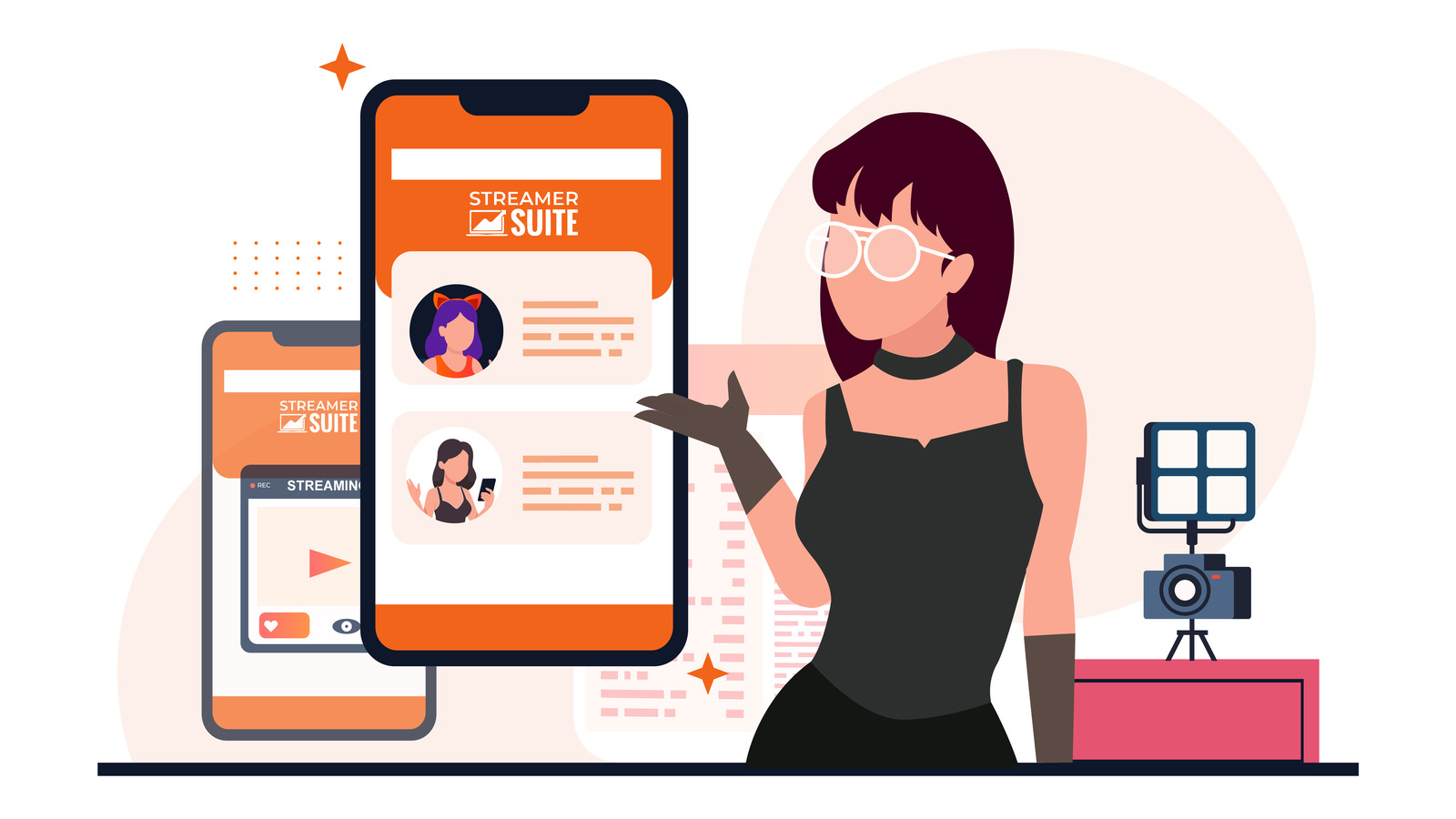
This is where StreamerSuite’s profile design service steps in. Each theme we design is fully responsive. It automatically adapts to the viewer’s screen size. Regardless of whether someone is viewing your profile on a widescreen desktop monitor, a laptop, a tablet, or a small phone, the layout is optimized for clarity and impact.
We design with a mobile-first mindset. This means:
When you choose a StreamerSuite theme, you’re not only choosing a design that looks good on your laptop. You’re selecting a design that caters to the 70% of your viewers who are visiting from a phone. This difference can have a significant impact on your engagement, tips, and overall fan growth.
To understand how our themes manage this challenge, examine our mobile-optimized profile designs and compare them with what you’re currently using. The difference will be clear.
A mobile-optimized profile not only looks tidy but also shifts how viewers interact with your content:
Even minor enhancements in mobile usability can result in measurable increases in engagement and revenue.
To maintain an appealing mobile profile, avoid these common mistakes:
StreamerSuite’s themes are engineered to avoid these pitfalls automatically. However, if you’re customizing your profile, these are essential points to remember.
Remember, a mobile-friendly design is not a one-time setup. As platforms change their layouts, as you add new content, and as your audience’s device preferences evolve, it’s important to:
Consider your profile a living part of your brand that needs constant attention.
As a streamer, if you’ve been designing your profile solely from a laptop or desktop perspective, it’s time to reassess your strategy. The majority of your audience is viewing a completely different version than you are.
Designing with mobile users in mind is not just a bonus feature. It’s a necessity if you want to connect with the majority of viewers who browse on their phones. Without this, you risk losing potential fans because your profile is challenging to navigate on the devices they use most.
With StreamerSuite’s mobile-optimized themes, you can be confident that your profile looks great and works perfectly on both mobile and desktop. This means you can focus on streaming, secure in the knowledge that your brand is making the right impression every time someone visits.
Your laptop may be your creative hub, but your mobile viewers are vital for your growth. Ensure your profile caters to them as the priority they are. For more insights on how to optimize your streaming profile for mobile users, check out this comprehensive guide to streaming success on mobile-first designing.